
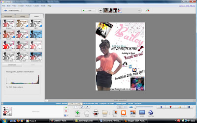
Thursday, 5 May 2011
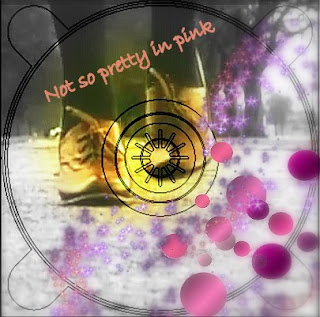
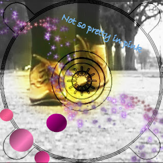
Final artwork - Digipak
Here is what my my digipack design would look like if it were t0 be made: (click to enlarge)

Wednesday, 4 May 2011

Tuesday, 3 May 2011
Evaluation - Question 1
1) In what ways does your media product use, develop or challenge forms and conventions of real media products?
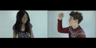
We adopted many aspect of real media ranging from music videos to advertisements. Our video consists of shot angles, themes and techniques from different real media products, that we adapted to suit our music videos, however some features are very similar and almost inter textual.
This image from Pink's video to 'Raise your glass' has the same inspiration as the the image from our video. We used WW1 pro women propaganda, however we discovered Pink's video after we had already used this image in our video. Pink's image and message she tries to portray to the audience is similar to that of Bailey, which is the empowerment of women.


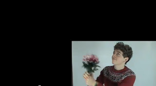
We decided to juxtapose ideas in our video to add effect to the message. We used camera angle to represent objectifying a woman, a tilt shot from her legs to her face. We took this idea from the video to 'Frim Fram Sauce' by The Nat King Cole Trio. This is to mock men objectifying women where as in the 'Frim Fram Sauce' video there the tilt shot has no relevance to the song other than just having the image of a woman's body in it.


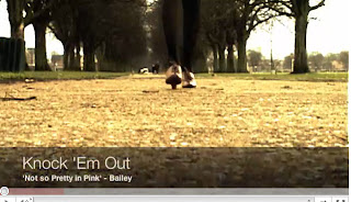
To add a real comical element and to make our video stand out, we decided to end our it with the female protagonist chasing the male with a shoe. We edited in an old movie style effect (sepia with vertical scratches and dots). The 'We 'no speak Americano' music video also shows the conventional chasing of another character portrayed in old comedies. We thought this was effective in our video.


Monday, 2 May 2011
Sunday, 1 May 2011
Evaluation - Question 4
4) How did you use media technologies in the construction and research, planning and evaluation stages?
Saturday, 30 April 2011
final post
Now I have come to the end my this project which has took a whole year, allot of preparation and hard work. I have made my blog as dynamic as possible using PowerPoint presentations, videos, prezis, word documents, pictures and blogs. I have used various digital technology equipment and software such as flip cams, gorilla pods, smart phone, Sony camera, Imovie, final cut, even social networking sites such as YouTube, face book and Twitter. I will be sad to see this blog closed however I know the effort put it will reflect on my grades. I will miss all my peers and teachers and the environment of our media class which was always so lively and vibrant. In the future if i do a project like this again there will be new technology out where I will be able to make my blog and work even more dynamic.
Thank you for taking the time to look at this blog, you will find my final digipack, advertisement, video and evaluation above this post.
x
Thank you for taking the time to look at this blog, you will find my final digipack, advertisement, video and evaluation above this post.
x
Friday, 29 April 2011

Tuesday, 26 April 2011
Editing music advertisement
I just found out today that I couldn't use any original images from google if they were not edited and I realised that my final magazine advertisement had an un-edited image from google of the WW1 propaganda - you can do it poster. Therefore I changed it and edited the image on Picasa as photo editing software. I used a focal lack and white as this would be eye catching to the audience as it brings out the colour in the woman's facial expression on the poster. Now I have edited the image of the poster my final draft of my advertisement is now finished.

Monday, 25 April 2011
Planning my evaluation
So for our evaluation we have to answer four questions:
1) In what ways does your media product use, develop or challenge forms and conventions of real media products
2) How effective is the combination of your main product and ancillary tasks?
3) What have you learned from your audience feedback?
4) How did you use media technologies in the construction and research, planning and evaluation stages?
Here are my chosen dynamic presentations:
- PowerPoint presentation > Question 2
- Short film, uploaded to YouTube > Question 4
- Essay style, blogging > Question 3
- Images and annotations on blog > Question 1
Friday, 22 April 2011
Final showing - Audience feedback
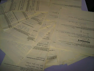
Thursday 7th April - On Thursday our media group hosted a final showing in our school hall to years 11, 12 and 13! We weren't expecting as many people that showed up so we ran out of chairs! This shows how media can unify people as they are interested in the new technologies and how we made our video. It's also inspirational to year 11's who are thinking of joining media, so I hope our video did it justice! We set up video booths at the end of people to give their commentary. Furthermore we also gave out questionnaires for people to fill in whilst viewing our video. It included questions such as 'What was your favourite part of the video.' We thought it was unnecessary to add a negative question as we couldn't improve it anyway. Whilst people watched our video I heard allot of people comment on how inspirational, funny and good it was, this was very reassuring as this shows we met the expectations of our target audience! Below are some pictures of the feedback from the questionnaires, along with a list of comments also put into a wordle. You will also find a video from two fellow peers giving us some commentary on our video from the video booth!
Here are just a few of the responses we got back.. pretty impressive!
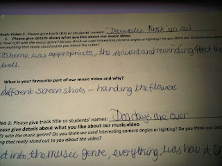
'Costume was appropriate, liked the forward and rewinding effect'
Overall I believe I was able to meet the audiences expectations, I am happy with my video and believe that in future projects I will be able to do the same again.

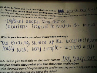
Here are just a few of the responses we got back.. pretty impressive!

'Costume was appropriate, liked the forward and rewinding effect'

'Different angles, song choice, locations matched the mood;
" Fits with music genre - Excellent"
"Loved all the different shots"
"Video went well with the song choice"
"Favourite part, the ending scene"
"Good effects and camera angles"
"Great lighting"
"Good use of different camera angles"
"Good locations, which matched song choice"
"White background was very effective"
"Fast pace shots worked well"
"Good use of rewinding effect"
"Good lip syncing"
"Fun video, matches song"
"Fantastic costumes, and locations"
"Great range of shots"
"very funny/cute"
"Excellent split screens"
"Funny/well edited"
"Creative use of props/costumes'
Use of props connect with the lyrics"
"Fantastic camera angles"
Great variety, fits with genre"
"Quirky and enjoyable because of the location changes"
"Upbeat got me grooving in my seat"
"Creative and effective ending"
Below is a wordle of words which often came up in the questionnaire.

Here is a video from the video booth of two of our peers giving us some feedback. This made us really happy as they really enjoyed it and they are the target audience we want to reach, so I feel reassured we have met their expectations... enjoy
Below I have summarised my feedback into 2 tables: a pie chart and a bar chart. This makes it easier for my to evaluate the strong parts of my video, and see what the audience enjoyed most. I will then be able to see if I conformed to the pop genre and met the audiences expectations. In the pie chart I showed my video to my form and asked them to say what aspects of the film they thought were the best. Here are my results.
my bar chart:
< Here this shows that people thought the editing was the best. This is very reassuring as the editing is the main component which fits the video together.
my pie chart: Overall this shows that people had very similar views of my video and they thought all aspect were good. These were the most familiar comments which popped up
Overall I believe I was able to meet the audiences expectations, I am happy with my video and believe that in future projects I will be able to do the same again.
Tuesday, 19 April 2011
Glitter effect

Today our group went up to the media room to edit the glitter scene. At first we edited to you saw the glitter been thrown at the protagonist once. However after Miss Foster watched it she thought it was abit plain. As the shot was so glamorous and sparkly we needed some kind of effect. Therefore we added a jumpy effect to make it more quirky.
Friday, 15 April 2011
Our split screens.
So after deciding to compose our split screens on Imovie below is our final product! We had to click on preferences to get the extra tools up which allowed us to conduct this editing. They make our video look allot more dynamic and profession, I am very happy with them.


Sunday, 10 April 2011
my opening credits.
In Imovie ttoday my group and I created our opening credits. We researched into how to make the credits on youtube as it has been a whole year since we last did this from our year 12 project on horror films. Below is the simple video we followed from youtube.
After following these steps this is now fresh in our memory. Firstly we selected the right transition we wanted. We decided to use the transition 'dark aroma' this was just a small dark rectangle and we chose to add white writing as this would look effective. We then chose the font 'round' as it was simple, but not to boring. This was eyecatching, however did not take the focus away from the main video. Below are the images of us creating the credits and our final version.
After following these steps this is now fresh in our memory. Firstly we selected the right transition we wanted. We decided to use the transition 'dark aroma' this was just a small dark rectangle and we chose to add white writing as this would look effective. We then chose the font 'round' as it was simple, but not to boring. This was eyecatching, however did not take the focus away from the main video. Below are the images of us creating the credits and our final version.

Thursday, 7 April 2011
Music advertisement - Idea 1 - The process
So I've decided to go with Idea 1!
I'm going to go through with you the making process which involved me making this. I'm going to go with a pink and white colour scheme as I want the audience to strait recognize the pop advertisement. I will use the same font as my digipack in pink so the audience can make a connection. Furthermore will add a picture of the WW1 propaganda this way the audience can get a feel for bailey; that she is a strong independent artists, she can also be related to successful artists such as Pink who is also known for her strong independent character.
Step 1:
So firstly as I wanted a tall picture of Oyinda so I went on the social networking site face book and found a really nice picture which was perfect for my advertisement. As I wanted the background to be white I had to cut this out on the photo editing software Paint. I did this with the picture zoomed in at 400% and used the eraser button. (see picture below)

Step 2:
Step 2 involved adding this picture in word. I copied and pasted this into word then added the extra bits. Firstly I added the artists name at the top right hand corner. I used the editing website to get the same font as my Digipack as this would create a connection between my two ancillary tasks. I then print screened this on paint again and added pink stars using the shape box. I thought this would give a feminine edge and reach out to younger audiences as well as older. Further more I added the WW1 propaganda to the top left hand corner of the word document which would create a connection with the music video and portray her as a strong independent character. Finally for this step I also added a small image of my digipack photo, this is for the audience to recognize the album so when they see it in a store they are likely to pick it up.
Step 3:
So this step is the final step which involves adding the writing. I'm going to add a website to promote her further so the audience can log onto it and find out the latest news and promotions. 'www.bailey.com' I will also add a release date and where to buy the album from. By adding this information the audience will be waiting for it with anticipation and are given clear instructions where to buy it from which makes it simple for the audience as they don't have to bother looking around. I added the writing from blingee.com. I thought that by using different fonts and colours this would make it more eye catching and dynamic for the audience.
Final version:
Tuesday, 5 April 2011
Researching opening titles
So it's time to add my opening credits to our music video as it is nearly completed. I am thinking of having the titles at the start if the video and having them quite simple so it doesn't distract the audience away from the video. Here are a few examples of opening titles I've found after watching various music channels such as MTV, base and 4music.
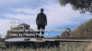 These are the opening titles for billy Kay's video this time. They have added the name, song title and who it's produced by. I like these titles as they are quite simple and suit the calm scene of the song. However I do find these a little boring, and I think the writing is too big for the screen as it takes your eye away from the main focus; the video.
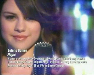 I like Selena Gomez's opening credits due to the use of different fonts. However I do think their is too much writing as credits are only on screen for 2-3 seconds. I think the use of white credits here is eye catching due to the sparkly background it brings out the white.
 My favourite credits are from Eliza Doolittle's song pack up. I think these are eye catching and the pink background really brings these out. Again she has the name of the artist, the song and the alum titles which is just enough information for the audience to read.
Friday, 1 April 2011
Changes to my digipak
So after some thought and revising my digipack research. I compared my digipack to others such as Lilly Allen, Gwen Stefania and Uffie. I realised my digipack didn't really conform to the pop genre. I have made a few minor adjustments to make my digipack look more like a pop album. To reassure myself i'm making the right descion I also asked my friend Becca what genre she thought my album cover is, she said It could be pop or indie. So therefore I definately need to make it look more pop as the audience need to be sure. The conversation is as follows:
 The 2 inside covers:
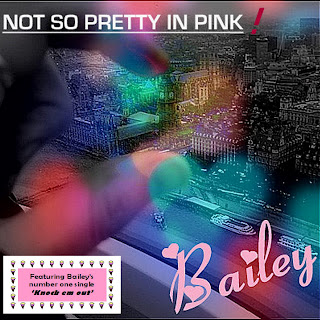
The Front cover:
I have left the front cover as it is as I really like the cover and think it represents pop and the artist Bailey coming from a London background, likewise to Lilly Allen who's song Knock em out inspired us.
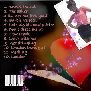
The Back cover:
I am now really happy with my design and belive it really fits my pop genre :)
 The 2 inside covers:
Before I used a sepia effect with the colours in the background. However whilst looking at my digipack before I really didn't think it fit the pop genre of an album. I was looking at Katy Perry's album cover and hers is very much pink, blue with candy sweets. These are generic conventions of a pop album. Using Picasa photo editing software I decided to change the two inside covers and made them more girly. I added pink polka dots to each corner so when they are next to each other the polka dots will have symmetry. Instead of using a sepia effect I instead used a black and white effect with a soft focal point in the middle to bring out the colour of her shoes and bringing attention ti the centre of the CD. I then used another photo editing software called Blingee. This is actually a website to you upload the pictures then add bits. This is the only way I was able to achieve the pink glitter effect. This really stands out against the black and white and gives a real feminine touch.


The Front cover:
I have left the front cover as it is as I really like the cover and think it represents pop and the artist Bailey coming from a London background, likewise to Lilly Allen who's song Knock em out inspired us.

The Back cover:
In the back cover I've left the background and the writing the same. However I felt it was important to have a picture of the artist so the audience can recognise the album with the artist and the genre. However although most albums have the artist on the front I decided to challenge this convention. In albums such as Uffie they have also not got the artist on the front and it still looks like a pop album. due to allot of pink. Here I've used a quirky picture of Bailey and added pink sparkles from blingee.com.

I am now really happy with my design and belive it really fits my pop genre :)
Wednesday, 30 March 2011
Friday, 25 March 2011
Not so pretty in pink - Track list
In a second group discussion we had to consider some titles for the album 'Not so pretty in pink' We needed them to have very pop, vibrant and give the audience a sense of belonging and feel happy. To target our audience of young and mature teens we needed to reflect their opinions and what they like. we used slang words such as 'getta' and related them to themes such boys, London , drinking and just the stereotypical view of that group. Here are a few we came up with the main featuring song being 'Knock em out'

Wednesday, 23 March 2011
Music advertisement conventions
When making a music advertisement it is important to understand the conventions of an advert as all of these convention work together to grab the audiences attention. Without these the advert would be dull, boring and useless...
An image of the artist, the digipack and video.
Band Name in bold letters
Album Name
Album reviews ... eg Daily mirror *****
Where can you purchase?...HMV, Amazon etc
Record Label Logo
Bonus tracks
main track
Website
Slogan/Strap line
Tour dates
Quotes from newspapers
Limited Edition
Offers to download
Name at the top of the advert
I will use these conventions as a guide to create my own music advertisement of my video Lilly Allen knock em out by Bailey!
Sunday, 20 March 2011
Analysis of my Digipak
Front cover:

This is the Final front cover of my digipak. In this cover I have challenged the conventions of a typical front cover with the artists face on it, yet still reflecting pop genre with the use of rose pink colour, and blue, purple and pink representation of girly pop. I Have also added a small label on the bottom left hand side on the album which states 'Featuring Baileys number one single 'Knock em out' with symbolic representation of pop genre using a border of ice creams. I think this gave a more quirky feel to the cover which represents Bailey as a quirky pop artist. With the use of London in the background with the artist essentially holding Big Ben this gives of a sense of power which is portrayed in the intertextual elements of the feminist theory. I didn't want to conform to the stereotypical version of a pop album with the artists face because I wanted my artist to be more original giving a sense of freedom and power which is represented with the picture. I think the audience of young teens could really relate to this as it draws them in. The font I used for Baileys name is a very girly font in a rose pink colour with hearts around. This conforms to the pop genre of hearts pink and girly which I thought would show the audience the genre strait away. My favourite bit of the cover has to be the soft focused fairy lights blended with the picture, this gives a soft, venerable feel to the cover, yet the components of the hand and London being very strong.
Back cover:

What I love about the back cover is the massive heart on the right hand side focused in red and blue. I thought using a strong red colour would show passion in the artist and prevail the pop genre and appeal to young teens as these are essentially the audience who would buy the album. The use of the shadow represents the boy in Knock em out shadowing the girl however she has a strong heart and doesn't conform to him. This again reflects the power concept throughout the video Knock em out. I've used a very girly pink font, this is to conform to pop genre characteristics and contrasts with the powerful love hear on the right hand side. The background is in a sepia effect with soft focus, I have used this to draw attention to the heard and the writing.
The 2 inside covers:


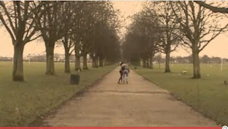
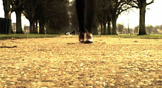
I used the screen shot of the feet walking down the path in this shot. I thought this looks like a very strong image and again portrays the power theme the artist is giving of. I contrasted and blended this in with the girly colours of purple, blue and pink on top. Furthermore the girly iconography of the lips and butterfly and symbolic codes of pop genre. I have used a rose in the second cover as a rose typically has thorns but is also romantic and girly. This represents the power feeling again as to say don't mess with me, like the knock em out video. However the rose also shows the girly side to the artist. I also added a sparkle effect on top of the CD which gives of a girly and feminine feel in binary opposition to the strong image of the shoe.

This is the Final front cover of my digipak. In this cover I have challenged the conventions of a typical front cover with the artists face on it, yet still reflecting pop genre with the use of rose pink colour, and blue, purple and pink representation of girly pop. I Have also added a small label on the bottom left hand side on the album which states 'Featuring Baileys number one single 'Knock em out' with symbolic representation of pop genre using a border of ice creams. I think this gave a more quirky feel to the cover which represents Bailey as a quirky pop artist. With the use of London in the background with the artist essentially holding Big Ben this gives of a sense of power which is portrayed in the intertextual elements of the feminist theory. I didn't want to conform to the stereotypical version of a pop album with the artists face because I wanted my artist to be more original giving a sense of freedom and power which is represented with the picture. I think the audience of young teens could really relate to this as it draws them in. The font I used for Baileys name is a very girly font in a rose pink colour with hearts around. This conforms to the pop genre of hearts pink and girly which I thought would show the audience the genre strait away. My favourite bit of the cover has to be the soft focused fairy lights blended with the picture, this gives a soft, venerable feel to the cover, yet the components of the hand and London being very strong.
Back cover:

What I love about the back cover is the massive heart on the right hand side focused in red and blue. I thought using a strong red colour would show passion in the artist and prevail the pop genre and appeal to young teens as these are essentially the audience who would buy the album. The use of the shadow represents the boy in Knock em out shadowing the girl however she has a strong heart and doesn't conform to him. This again reflects the power concept throughout the video Knock em out. I've used a very girly pink font, this is to conform to pop genre characteristics and contrasts with the powerful love hear on the right hand side. The background is in a sepia effect with soft focus, I have used this to draw attention to the heard and the writing.
The 2 inside covers:


I used the screen shot of the feet walking down the path in this shot. I thought this looks like a very strong image and again portrays the power theme the artist is giving of. I contrasted and blended this in with the girly colours of purple, blue and pink on top. Furthermore the girly iconography of the lips and butterfly and symbolic codes of pop genre. I have used a rose in the second cover as a rose typically has thorns but is also romantic and girly. This represents the power feeling again as to say don't mess with me, like the knock em out video. However the rose also shows the girly side to the artist. I also added a sparkle effect on top of the CD which gives of a girly and feminine feel in binary opposition to the strong image of the shoe.
Thursday, 17 March 2011
Tuesday, 15 March 2011
split screen research
So as planned in our story board were going to attempt to do a split screen either in Imovie or final cut pro. Split screens look very effective and make the video look dynamic and professional. However firstly we need to find out how to do it. Below are two videos, one from imovie and one from final cut pro which we could potentially use either.
Imovie turorial:
I think were going to go with Imovie to do our split screens as it is alot simpler and we are familiar we the software. we have already started to make the split screens which I will upload on my blog on the next post.
Final cut tutorial:
I found this video very tricky to understand. Whilst trying to do the split screens we didn't even know how to add the events over from imovie. This is quite a tricky software to use as i'm so used to Imovie, however it is good for precise editing.
Here is a video of: De Staat - The Fantastic Journey Of The Underground Man
This is a fantastic video for split screens. This is a very advanced video and very inspirational. I was fascinated when I first watched it!
Below is a comment from one of the producers:
Fun and tricky is-it-or-isn't-it video by Andre Maat for Holland's De Staat. Maat says: "It seems to be a classic split-screen performance music video but then turns out to be visual trickery. We shot all effects in-camera, playing with the set-design, perspectives and colours. All 'splits' are made from wood, zippers, gaffa tape, etc." Good stuff.
Friday, 11 March 2011
Pop Music advertisements
Madonna Advertisement

Madonna is a pop genre sensation. I picked this advert as I believe it represents pop very well with the use of bright vibrant colours, bold statement letters and the artists image. The shot is a close up of Madonna, she is also pulling a very calm but seductive facial expression. This here shows that Madonna is a big star as the whole of her face nearly glazes the advert.
The main use of colours are blue, pink and yellow. These colours are very much linked to pop, this also gives the audience a taste of the music as being vibrant, dance and fun music. I think by only using a limited number of colours on the advert is more effective as the audience doesn't get confused and can focus on the main elements of the advert: The artist and album name. This is a technique I will adopt when producing my music advertisement. Furthermore I am not surprised that this advert doesn't have any magazine reviews on, this is because Madonna is such a well known and love artist everyone has high expectations of her anyway.
Britney Spears advertisement
 Unlike Madonnas album advertisement this is very different. Unlike Madonna, Britney is not gracing the cover of the advert. This is most likely because this advert was for Britney's come back album as she had not made one in a few years. The whole album was also focused around the theme of a circus; therefore this was enough for her audience to recognize the advert.
Britney's name is in a very large font, this is to attract the audience to the name as the image is not visible. This is something I'm likely to do in my advert. The colour scheme is, unlike Madonnas is very simple. She just uses the colours red and yellow, however this is effective as it fits in with the circus theme. When making my digipack I will have to think about the individual elements of my video instead of just conforming to the usual pop advert.
Gwen Stefanni music advertisement
Gwen Stefanni music advertisement

This advert is probably my most inspirational due to the conventions of it. I really like bold title name of the artist as this stands out and catches the audiences eye; also the font of the writing is very elegant and conforms to pop genre, it is also on the album cover which creates a connection with the digipack. The simple colour scheme like Madonnas and Britney's adverts is also eye catching. The gold, pink and white really complement the whole advertisement as they all fit in really well. However I really like the edge that this advertisement gives of. I like the way the artist is holding her facial expression and body language as it shows she has an edge and isn't just another glamorous pop artists. However she also conforms to pop genre with her diamante sticks which gives an elegant touch.
Furthermore I really like how the image of her digipack is at the bottom left hand corner of the advertisement, this gives the audience a connection with the artist, album and advertisement so they are more likely to buy the album when shopping around in HMV for example. I am going to do this for my digipack as it creates a deeper link to the artists products.
Monday, 7 March 2011
Pink pillow effects

Today we edited the clip below.
We wanted a reverse effect so she throw the pillow but it looks as if it is thrown back at her so we simply added the same clip again but put a reverse on the second part:

We also wanted the pillow to be pink. Firstly we added a black and white effect to it so the pink would stand out. However this was too difficult to add the pink effect as Imovie was not that
advanced.
Tuesday, 1 March 2011
Editing progress - adding effects.
So today I came onto the macs to do some editing. We added some effects onto the video. Here are some examples below of the effects we added:
Here I added a black and white effect. I though that by breaking up the colour a bit it would make the video more dynamic
Here we added a old grain theme. This was inspired by the americano film idea. This gives our video that extra edge and makes it more interesting.
By using this heatwave effect it brang out the colours of green and blue more which made the film look brighter and more eye catching.

Here I added a black and white effect. I though that by breaking up the colour a bit it would make the video more dynamic

Here we added a old grain theme. This was inspired by the americano film idea. This gives our video that extra edge and makes it more interesting.

By using this heatwave effect it brang out the colours of green and blue more which made the film look brighter and more eye catching.
Monday, 21 February 2011
Digipak Preperation - The making process
Preparation for the making of my final digipak.
I have decided to go with IDEA 1 This is because I really like the idea of the London background blended in with fairy lights. With the use of fairy lights blended in this will give of all the iconic girly colours associated with pop genre, however giving a twist to the protagonist making her seem not as venerable as the typical 'love stricken' songs most pop artist talk about such as Pixie Lott, Broken arrow. I will also be challenging the conventional pop album by not having the protagonist on the front which conforms to the male gaze to get both genders locked in the image, this also relates to the inter textual concepts of the feminist approach within our music video.
So after designing and picking which idea to go with for my digipak I went out and took some pictures of fairy lights which I will use in my sketch. Firstly I went to Maplin; an electrical store to take a video on the HD flip camera of the lights in Maplin
 Above is an example of a front cover attempt. After I edited this on Picasa which is a photo editing software I edited the picture and added a Focal black and white effect on top which allowed me to focus on the colour yet leaving the rest of the picture in black and white scale. After this I added an intense of focus around the edges of the lights then around the whole picture to give a soft yet girly look with the glimmers of light appearing. However I really didn't like the way it turned out out it didn't give of a fairy light appeal as it was a disco ball.
After this failed attempts I then went down to B&Q and took a picture of some pretty bedroom bulb lights which were on a black background which I thought was perfect! which were on show and turned on! After learning from my previous mistake of only taking one photo I decided to get out my Christmas tree lights and turned them on just in case I didn't like the picture from B&Q.
I decided to use the picture I took in B&Q as the layout against the black background looked professional and I could use the multi-exposure effect when blended with the London picture.
London pictures for the front cover:
As stated earlier I am planning on using a picture from London as I want the artist to resemble a London background, similar to that of Lilly Allen, also one of the track lists is called 'London Town' Here are a few examples of pictures I have edited, I took when I went on the London eye last year. Taking pictures from the London eye gave an amazing view as you could see the whole city.
Picture one:

I have to admit this is my favourite picture of all! I love how my hand looks like it holding big Ben. I think this could be a very powerful shot and show the protagonist in charge as London is such a big city yet she has it in the palm of her hand. This also draws the audience in as when we see this we want to look closer to see what it is. I have added a black and white focal point with the picture of big Ben shining through. I think this makes this even more powerful as it draws attention to the middle of the image which yet again represent power that she is in control.
Picture 2:
 I also really like this picture of the London eye. It's a very clear picture which shows iconic representation of London to reflect the artists background, however as my idea is to blend in fairy lights I don't think this picture would be as clear.
Picture 3:

I really like this picture. I especially like the vintage look to the picture, it looks as it's an old picture due to the colour. I love how you can see the whole of London which reflects the artist and gives power as it's over looking the city.
In my idea I have chosen to have screen shots of the artist shoes walking down the path with iconic representation on top. I think this will look good for the CD as it shows power that she won't be messed about with yet shows the girly side with the iconic representation.
Below is the screenshot of the feet I want to use:

Tomorrow I'm going to start the making process. With all my ideas planned and pictures chosen I will start the blended pictures together and the editing =]
Subscribe to:
Posts (Atom)