Bailey - Knock em out

Showing posts with label DigiPack research. Show all posts

Friday, 1 April 2011

Changes to my digipak

So after some thought and revising my digipack research. I compared my digipack to others such as Lilly Allen, Gwen Stefania and Uffie. I realised my digipack didn't really conform to the pop genre. I have made a few minor adjustments to make my digipack look more like a pop album. To reassure myself i'm making the right descion I also asked my friend Becca what genre she thought my album cover is, she said It could be pop or indie. So therefore I definately need to make it look more pop as the audience need to be sure. The conversation is as follows:

The 2 inside covers:


Before I used a sepia effect with the colours in the background. However whilst looking at my digipack before I really didn't think it fit the pop genre of an album. I was looking at Katy Perry's album cover and hers is very much pink, blue with candy sweets. These are generic conventions of a pop album. Using Picasa photo editing software I decided to change the two inside covers and made them more girly. I added pink polka dots to each corner so when they are next to each other the polka dots will have symmetry. Instead of using a sepia effect I instead used a black and white effect with a soft focal point in the middle to bring out the colour of her shoes and bringing attention ti the centre of the CD. I then used another photo editing software called Blingee. This is actually a website to you upload the pictures then add bits. This is the only way I was able to achieve the pink glitter effect. This really stands out against the black and white and gives a real feminine touch.


The Front cover:


I have left the front cover as it is as I really like the cover and think it represents pop and the artist Bailey coming from a London background, likewise to Lilly Allen who's song Knock em out inspired us.


The Back cover:


In the back cover I've left the background and the writing the same. However I felt it was important to have a picture of the artist so the audience can recognise the album with the artist and the genre. However although most albums have the artist on the front I decided to challenge this convention. In albums such as Uffie they have also not got the artist on the front and it still looks like a pop album. due to allot of pink. Here I've used a quirky picture of Bailey and added pink sparkles from blingee.com.


I am now really happy with my design and belive it really fits my pop genre :)

Friday, 25 March 2011

Not so pretty in pink - Track list

In a second group discussion we had to consider some titles for the album 'Not so pretty in pink' We needed them to have very pop, vibrant and give the audience a sense of belonging and feel happy. To target our audience of young and mature teens we needed to reflect their opinions and what they like. we used slang words such as 'getta' and related them to themes such boys, London , drinking and just the stereotypical view of that group. Here are a few we came up with the main featuring song being 'Knock em out'


Monday, 21 February 2011

Digipak Preperation - The making process


Preparation for the making of my final digipak.


I have decided to go with IDEA 1 This is because I really like the idea of the London background blended in with fairy lights. With the use of fairy lights blended in this will give of all the iconic girly colours associated with pop genre, however giving a twist to the protagonist making her seem not as venerable as the typical 'love stricken' songs most pop artist talk about such as Pixie Lott, Broken arrow. I will also be challenging the conventional pop album by not having the protagonist on the front which conforms to the male gaze to get both genders locked in the image, this also relates to the inter textual concepts of the feminist approach within our music video.


So after designing and picking which idea to go with for my digipak I went out and took some pictures of fairy lights which I will use in my sketch. Firstly I went to Maplin; an electrical store to take a video on the HD flip camera of the lights in Maplin

Above is an example of a front cover attempt. After I edited this on Picasa which is a photo editing software I edited the picture and added a Focal black and white effect on top which allowed me to focus on the colour yet leaving the rest of the picture in black and white scale. After this I added an intense of focus around the edges of the lights then around the whole picture to give a soft yet girly look with the glimmers of light appearing. However I really didn't like the way it turned out out it didn't give of a fairy light appeal as it was a disco ball.


After this failed attempts I then went down to B&Q and took a picture of some pretty bedroom bulb lights which were on a black background which I thought was perfect! which were on show and turned on! After learning from my previous mistake of only taking one photo I decided to get out my Christmas tree lights and turned them on just in case I didn't like the picture from B&Q.
I decided to use the picture I took in B&Q as the layout against the black background looked professional and I could use the multi-exposure effect when blended with the London picture.


London picture
s for the front cover:

As stated earlier I am planning on using a picture from London as I want the artist to resemble a London background, similar to that of Lilly Allen, also one of the track lists is called 'London Town' Here are a few examples of pictures I have edited, I took when I went on the London eye last year. Taking pictures from the London eye gave an amazing view as you could see the whole city.

Picture one:


I have to admit this is my favourite picture of all! I love how my hand looks like it holding big Ben. I think this could be a very powerful shot and show the protagonist in charge as London is such a big city yet she has it in the palm of her hand. This also draws the audience in as when we see this we want to look closer to see what it is. I have added a black and white focal point with the picture of big Ben shining through. I think this makes this even more powerful as it draws attention to the middle of the image which yet again represent power that she is in control.


Picture 2:

I also really like this picture of the London eye. It's a very clear picture which shows iconic representation of London to reflect the artists background, however as my idea is to blend in fairy lights I don't think this picture would be as clear.

Picture 3:


I really like this picture. I especially like the vintage look to the picture, it looks as it's an old picture due to the colour. I love how you can see the whole of London which reflects the artist and gives power as it's over looking the city.

In my idea I have chosen to have screen shots of the artist shoes walking down the path with iconic representation on top. I think this will look good for the CD as it shows power that she won't be messed about with yet shows the girly side with the iconic representation.
Below is the screenshot of the feet I want to use:


Tomorrow I'm going to start the making process. With all my ideas planned and pictures chosen I will start the blended pictures together and the editing =]

Thursday, 10 February 2011

Making my Digipak

In this post I will talk about the procedure involved in making my digipak. I mainly used Picasa which is a photo editing software, I also used publisher and paint to make for example the heart on the back cover.


Monday, 7 February 2011

Wednesday, 2 February 2011

Album title.


In our discussion the other day we were thinking of what we should call the album! The group came up with a really good name which is catchy and represents the singer.


I think this is a really effective name as we are trying to portray in our video that we women can stand up for themselves and don't need male attention to survive. This is shown by rejecting the so called attempts to get the girls attention.

Tuesday, 1 February 2011

Analysis of Pop digipak


Katy Perry - Teenage dream

Within this digipak there are clear forms and conventions to pop. This digipak conforms to the conventions of the most common digipaks as shown in my previous research.


The front of the digipak

The front of digipaks are usually filled with the artist. This is to promote the star to sell the record and for the audience to feel connected with the song and the star. Katy Perry's digipak conforms to this common convention. Allot of the time the artists on the front of digipaks are presented provocatively and revealing to grab the audience's eye. In Katy Perry's front cover this conforms to this with the minimal to none clothing surrounded by a pink cloud. Her facial expression also grabs the audience, this is known as the male gaze and is targeting a wider audience. The use of primary colours such as pink and baby blue in this digipak give us the feel that this is definitely a pop genre style of music. This mainly targets young teens and also children with the use of a candy theme. Younger children would see the artist floating on candy floss which gives a young appeal. The overall pictures and theme of the digipak are photographs with a bit of design in the clouds. I would expect to see a very pink a girls cover in a pop digipak which is what katy's digipak conforms to.

Back of the digipak.


Usually in most digipaks they consist of the album tracks and bar code which has the digipak theme running through. Katy's digipak conforms to this. She uses the candy theme running through the back cover with candy like font writing which is pink and candy floss backdrop. The lettering of the tracks fits in with the pop genre as its very cute, girly and, pink.

Side of the digipak

The side picture of the digipak just presents a closeup picture of Katy on candy floss again representing the male gaze. This is to draw the attention of the eyes to her face and we are more like;y to buy the album as we feel connected to her. The side cover also conforms to the candy floss theme which is targeting the target audience.

Cd compartment

The CD compartment also continues the candy theme with the use of Katy making a cake. The black back drop is really effective here as it brings out the bright and girly colours of the cakes. The use of Katy making a cake here make her seem very sweet, Innocent and young which is representing her target audience. This cover will behind the CD holder, the CD holder is common in digipaks as it keeps the Cd secure, and yet is still lightweight. The CD's themselves also carry the candy theme with bright colours representing doughnuts. This again portrays the young sweet target audience.


I like this digipak. The theme of candy makes me feel young and that the genre is more to my taste. I also feel connected with the artist by the pictures on the front which make me feel I could connect with the lyrics of the song. This shows how the digipak is an important aspect for the sales of albums.

Monday, 31 January 2011

DigiPak research


What is a digipak?

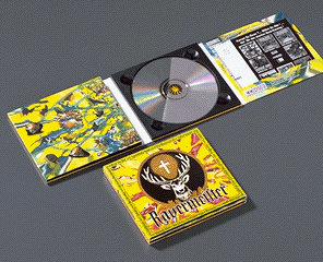
Digipacks are a type of CD packaging made out of card stock or other heavy paper/cardboard material. Digipacks can flip open like a book, or it can have three parts, so that one portion of the packaging opens to the right and one to the left, with the CD in the center portion. Usually, the portion of the digipack that hold the CD is made of plastic like a traditional jewel case CD - the plastic part is simply attached to the paper background.

Dimensions of a digipak:

The most common size is the 4pp Digipak which measures 139.5mm x 6mm x 125.5 mm.


Material used in a digipak?


This CD and DVD packaging comes in double thickness card, hardback or textured cover options made from environmental friendly materials.
Digipaks usually made with 300 gsm card, it can be 'Glossy' or 'Varnished' A 'Pop Girl Band' would use glossy because it portrays their glamour and femininity.
The colours in the digipak also determine the target audience. If I were looking to buy a pop CD I'd look for colours that are bright a feminine such as pink.


Sunday, 30 January 2011

Analysing CD covers

So now is the task of researching album covers to give me ideas to what I want my cover to look like, on the presentation I've made I have analysed 3 artists including: Uffie, Lilly Allen and Agnes.