
Showing posts with label Final Digipak. Show all posts
Showing posts with label Final Digipak. Show all posts
Thursday, 5 May 2011
Final artwork - Digipak
Here is what my my digipack design would look like if it were t0 be made: (click to enlarge)


Friday, 1 April 2011
Changes to my digipak
So after some thought and revising my digipack research. I compared my digipack to others such as Lilly Allen, Gwen Stefania and Uffie. I realised my digipack didn't really conform to the pop genre. I have made a few minor adjustments to make my digipack look more like a pop album. To reassure myself i'm making the right descion I also asked my friend Becca what genre she thought my album cover is, she said It could be pop or indie. So therefore I definately need to make it look more pop as the audience need to be sure. The conversation is as follows:
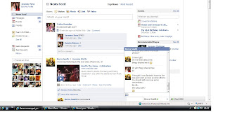 The 2 inside covers:
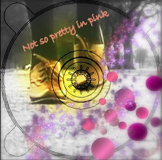
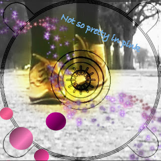
The Front cover:
I have left the front cover as it is as I really like the cover and think it represents pop and the artist Bailey coming from a London background, likewise to Lilly Allen who's song Knock em out inspired us.
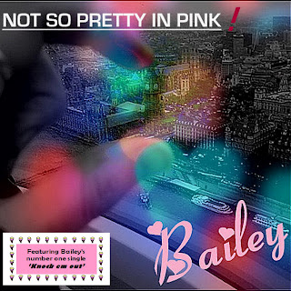
The Back cover:
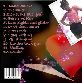
I am now really happy with my design and belive it really fits my pop genre :)
 The 2 inside covers:
Before I used a sepia effect with the colours in the background. However whilst looking at my digipack before I really didn't think it fit the pop genre of an album. I was looking at Katy Perry's album cover and hers is very much pink, blue with candy sweets. These are generic conventions of a pop album. Using Picasa photo editing software I decided to change the two inside covers and made them more girly. I added pink polka dots to each corner so when they are next to each other the polka dots will have symmetry. Instead of using a sepia effect I instead used a black and white effect with a soft focal point in the middle to bring out the colour of her shoes and bringing attention ti the centre of the CD. I then used another photo editing software called Blingee. This is actually a website to you upload the pictures then add bits. This is the only way I was able to achieve the pink glitter effect. This really stands out against the black and white and gives a real feminine touch.


The Front cover:
I have left the front cover as it is as I really like the cover and think it represents pop and the artist Bailey coming from a London background, likewise to Lilly Allen who's song Knock em out inspired us.

The Back cover:
In the back cover I've left the background and the writing the same. However I felt it was important to have a picture of the artist so the audience can recognise the album with the artist and the genre. However although most albums have the artist on the front I decided to challenge this convention. In albums such as Uffie they have also not got the artist on the front and it still looks like a pop album. due to allot of pink. Here I've used a quirky picture of Bailey and added pink sparkles from blingee.com.

I am now really happy with my design and belive it really fits my pop genre :)
Sunday, 20 March 2011
Analysis of my Digipak
Front cover:

This is the Final front cover of my digipak. In this cover I have challenged the conventions of a typical front cover with the artists face on it, yet still reflecting pop genre with the use of rose pink colour, and blue, purple and pink representation of girly pop. I Have also added a small label on the bottom left hand side on the album which states 'Featuring Baileys number one single 'Knock em out' with symbolic representation of pop genre using a border of ice creams. I think this gave a more quirky feel to the cover which represents Bailey as a quirky pop artist. With the use of London in the background with the artist essentially holding Big Ben this gives of a sense of power which is portrayed in the intertextual elements of the feminist theory. I didn't want to conform to the stereotypical version of a pop album with the artists face because I wanted my artist to be more original giving a sense of freedom and power which is represented with the picture. I think the audience of young teens could really relate to this as it draws them in. The font I used for Baileys name is a very girly font in a rose pink colour with hearts around. This conforms to the pop genre of hearts pink and girly which I thought would show the audience the genre strait away. My favourite bit of the cover has to be the soft focused fairy lights blended with the picture, this gives a soft, venerable feel to the cover, yet the components of the hand and London being very strong.
Back cover:

What I love about the back cover is the massive heart on the right hand side focused in red and blue. I thought using a strong red colour would show passion in the artist and prevail the pop genre and appeal to young teens as these are essentially the audience who would buy the album. The use of the shadow represents the boy in Knock em out shadowing the girl however she has a strong heart and doesn't conform to him. This again reflects the power concept throughout the video Knock em out. I've used a very girly pink font, this is to conform to pop genre characteristics and contrasts with the powerful love hear on the right hand side. The background is in a sepia effect with soft focus, I have used this to draw attention to the heard and the writing.
The 2 inside covers:


I used the screen shot of the feet walking down the path in this shot. I thought this looks like a very strong image and again portrays the power theme the artist is giving of. I contrasted and blended this in with the girly colours of purple, blue and pink on top. Furthermore the girly iconography of the lips and butterfly and symbolic codes of pop genre. I have used a rose in the second cover as a rose typically has thorns but is also romantic and girly. This represents the power feeling again as to say don't mess with me, like the knock em out video. However the rose also shows the girly side to the artist. I also added a sparkle effect on top of the CD which gives of a girly and feminine feel in binary opposition to the strong image of the shoe.

This is the Final front cover of my digipak. In this cover I have challenged the conventions of a typical front cover with the artists face on it, yet still reflecting pop genre with the use of rose pink colour, and blue, purple and pink representation of girly pop. I Have also added a small label on the bottom left hand side on the album which states 'Featuring Baileys number one single 'Knock em out' with symbolic representation of pop genre using a border of ice creams. I think this gave a more quirky feel to the cover which represents Bailey as a quirky pop artist. With the use of London in the background with the artist essentially holding Big Ben this gives of a sense of power which is portrayed in the intertextual elements of the feminist theory. I didn't want to conform to the stereotypical version of a pop album with the artists face because I wanted my artist to be more original giving a sense of freedom and power which is represented with the picture. I think the audience of young teens could really relate to this as it draws them in. The font I used for Baileys name is a very girly font in a rose pink colour with hearts around. This conforms to the pop genre of hearts pink and girly which I thought would show the audience the genre strait away. My favourite bit of the cover has to be the soft focused fairy lights blended with the picture, this gives a soft, venerable feel to the cover, yet the components of the hand and London being very strong.
Back cover:

What I love about the back cover is the massive heart on the right hand side focused in red and blue. I thought using a strong red colour would show passion in the artist and prevail the pop genre and appeal to young teens as these are essentially the audience who would buy the album. The use of the shadow represents the boy in Knock em out shadowing the girl however she has a strong heart and doesn't conform to him. This again reflects the power concept throughout the video Knock em out. I've used a very girly pink font, this is to conform to pop genre characteristics and contrasts with the powerful love hear on the right hand side. The background is in a sepia effect with soft focus, I have used this to draw attention to the heard and the writing.
The 2 inside covers:


I used the screen shot of the feet walking down the path in this shot. I thought this looks like a very strong image and again portrays the power theme the artist is giving of. I contrasted and blended this in with the girly colours of purple, blue and pink on top. Furthermore the girly iconography of the lips and butterfly and symbolic codes of pop genre. I have used a rose in the second cover as a rose typically has thorns but is also romantic and girly. This represents the power feeling again as to say don't mess with me, like the knock em out video. However the rose also shows the girly side to the artist. I also added a sparkle effect on top of the CD which gives of a girly and feminine feel in binary opposition to the strong image of the shoe.
Thursday, 10 February 2011
Making my Digipak
In this post I will talk about the procedure involved in making my digipak. I mainly used Picasa which is a photo editing software, I also used publisher and paint to make for example the heart on the back cover.
Subscribe to:
Posts (Atom)