Now I have come to the end my this project which has took a whole year, allot of preparation and hard work. I have made my blog as dynamic as possible using PowerPoint presentations, videos, prezis, word documents, pictures and blogs. I have used various digital technology equipment and software such as flip cams, gorilla pods, smart phone, Sony camera, Imovie, final cut, even social networking sites such as YouTube, face book and Twitter. I will be sad to see this blog closed however I know the effort put it will reflect on my grades. I will miss all my peers and teachers and the environment of our media class which was always so lively and vibrant. In the future if i do a project like this again there will be new technology out where I will be able to make my blog and work even more dynamic.
Thank you for taking the time to look at this blog, you will find my final digipack, advertisement, video and evaluation above this post.
x
Saturday, 30 April 2011
Friday, 29 April 2011

Tuesday, 26 April 2011
Editing music advertisement
I just found out today that I couldn't use any original images from google if they were not edited and I realised that my final magazine advertisement had an un-edited image from google of the WW1 propaganda - you can do it poster. Therefore I changed it and edited the image on Picasa as photo editing software. I used a focal lack and white as this would be eye catching to the audience as it brings out the colour in the woman's facial expression on the poster. Now I have edited the image of the poster my final draft of my advertisement is now finished.

Monday, 25 April 2011
Planning my evaluation
So for our evaluation we have to answer four questions:
1) In what ways does your media product use, develop or challenge forms and conventions of real media products
2) How effective is the combination of your main product and ancillary tasks?
3) What have you learned from your audience feedback?
4) How did you use media technologies in the construction and research, planning and evaluation stages?
Here are my chosen dynamic presentations:
- PowerPoint presentation > Question 2
- Short film, uploaded to YouTube > Question 4
- Essay style, blogging > Question 3
- Images and annotations on blog > Question 1
Friday, 22 April 2011
Final showing - Audience feedback
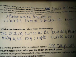
Thursday 7th April - On Thursday our media group hosted a final showing in our school hall to years 11, 12 and 13! We weren't expecting as many people that showed up so we ran out of chairs! This shows how media can unify people as they are interested in the new technologies and how we made our video. It's also inspirational to year 11's who are thinking of joining media, so I hope our video did it justice! We set up video booths at the end of people to give their commentary. Furthermore we also gave out questionnaires for people to fill in whilst viewing our video. It included questions such as 'What was your favourite part of the video.' We thought it was unnecessary to add a negative question as we couldn't improve it anyway. Whilst people watched our video I heard allot of people comment on how inspirational, funny and good it was, this was very reassuring as this shows we met the expectations of our target audience! Below are some pictures of the feedback from the questionnaires, along with a list of comments also put into a wordle. You will also find a video from two fellow peers giving us some commentary on our video from the video booth!
Here are just a few of the responses we got back.. pretty impressive!
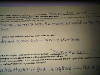
'Costume was appropriate, liked the forward and rewinding effect'
Overall I believe I was able to meet the audiences expectations, I am happy with my video and believe that in future projects I will be able to do the same again.

Here are just a few of the responses we got back.. pretty impressive!

'Costume was appropriate, liked the forward and rewinding effect'

'Different angles, song choice, locations matched the mood;
" Fits with music genre - Excellent"
"Loved all the different shots"
"Video went well with the song choice"
"Favourite part, the ending scene"
"Good effects and camera angles"
"Great lighting"
"Good use of different camera angles"
"Good locations, which matched song choice"
"White background was very effective"
"Fast pace shots worked well"
"Good use of rewinding effect"
"Good lip syncing"
"Fun video, matches song"
"Fantastic costumes, and locations"
"Great range of shots"
"very funny/cute"
"Excellent split screens"
"Funny/well edited"
"Creative use of props/costumes'
Use of props connect with the lyrics"
"Fantastic camera angles"
Great variety, fits with genre"
"Quirky and enjoyable because of the location changes"
"Upbeat got me grooving in my seat"
"Creative and effective ending"
Below is a wordle of words which often came up in the questionnaire.

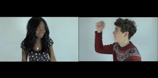
Here is a video from the video booth of two of our peers giving us some feedback. This made us really happy as they really enjoyed it and they are the target audience we want to reach, so I feel reassured we have met their expectations... enjoy
Below I have summarised my feedback into 2 tables: a pie chart and a bar chart. This makes it easier for my to evaluate the strong parts of my video, and see what the audience enjoyed most. I will then be able to see if I conformed to the pop genre and met the audiences expectations. In the pie chart I showed my video to my form and asked them to say what aspects of the film they thought were the best. Here are my results.
my bar chart:
< Here this shows that people thought the editing was the best. This is very reassuring as the editing is the main component which fits the video together.
my pie chart: Overall this shows that people had very similar views of my video and they thought all aspect were good. These were the most familiar comments which popped up
Overall I believe I was able to meet the audiences expectations, I am happy with my video and believe that in future projects I will be able to do the same again.
Tuesday, 19 April 2011
Glitter effect

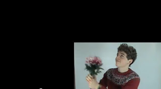
Today our group went up to the media room to edit the glitter scene. At first we edited to you saw the glitter been thrown at the protagonist once. However after Miss Foster watched it she thought it was abit plain. As the shot was so glamorous and sparkly we needed some kind of effect. Therefore we added a jumpy effect to make it more quirky.
Friday, 15 April 2011
Our split screens.
So after deciding to compose our split screens on Imovie below is our final product! We had to click on preferences to get the extra tools up which allowed us to conduct this editing. They make our video look allot more dynamic and profession, I am very happy with them.


Sunday, 10 April 2011
my opening credits.
In Imovie ttoday my group and I created our opening credits. We researched into how to make the credits on youtube as it has been a whole year since we last did this from our year 12 project on horror films. Below is the simple video we followed from youtube.
After following these steps this is now fresh in our memory. Firstly we selected the right transition we wanted. We decided to use the transition 'dark aroma' this was just a small dark rectangle and we chose to add white writing as this would look effective. We then chose the font 'round' as it was simple, but not to boring. This was eyecatching, however did not take the focus away from the main video. Below are the images of us creating the credits and our final version.
After following these steps this is now fresh in our memory. Firstly we selected the right transition we wanted. We decided to use the transition 'dark aroma' this was just a small dark rectangle and we chose to add white writing as this would look effective. We then chose the font 'round' as it was simple, but not to boring. This was eyecatching, however did not take the focus away from the main video. Below are the images of us creating the credits and our final version.

Thursday, 7 April 2011
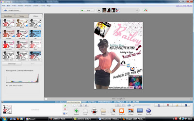
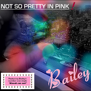
Music advertisement - Idea 1 - The process
So I've decided to go with Idea 1!
I'm going to go through with you the making process which involved me making this. I'm going to go with a pink and white colour scheme as I want the audience to strait recognize the pop advertisement. I will use the same font as my digipack in pink so the audience can make a connection. Furthermore will add a picture of the WW1 propaganda this way the audience can get a feel for bailey; that she is a strong independent artists, she can also be related to successful artists such as Pink who is also known for her strong independent character.
Step 1:
So firstly as I wanted a tall picture of Oyinda so I went on the social networking site face book and found a really nice picture which was perfect for my advertisement. As I wanted the background to be white I had to cut this out on the photo editing software Paint. I did this with the picture zoomed in at 400% and used the eraser button. (see picture below)

Step 2:
Step 2 involved adding this picture in word. I copied and pasted this into word then added the extra bits. Firstly I added the artists name at the top right hand corner. I used the editing website to get the same font as my Digipack as this would create a connection between my two ancillary tasks. I then print screened this on paint again and added pink stars using the shape box. I thought this would give a feminine edge and reach out to younger audiences as well as older. Further more I added the WW1 propaganda to the top left hand corner of the word document which would create a connection with the music video and portray her as a strong independent character. Finally for this step I also added a small image of my digipack photo, this is for the audience to recognize the album so when they see it in a store they are likely to pick it up.
Step 3:
So this step is the final step which involves adding the writing. I'm going to add a website to promote her further so the audience can log onto it and find out the latest news and promotions. 'www.bailey.com' I will also add a release date and where to buy the album from. By adding this information the audience will be waiting for it with anticipation and are given clear instructions where to buy it from which makes it simple for the audience as they don't have to bother looking around. I added the writing from blingee.com. I thought that by using different fonts and colours this would make it more eye catching and dynamic for the audience.
Final version:
Tuesday, 5 April 2011
Researching opening titles
So it's time to add my opening credits to our music video as it is nearly completed. I am thinking of having the titles at the start if the video and having them quite simple so it doesn't distract the audience away from the video. Here are a few examples of opening titles I've found after watching various music channels such as MTV, base and 4music.
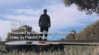 These are the opening titles for billy Kay's video this time. They have added the name, song title and who it's produced by. I like these titles as they are quite simple and suit the calm scene of the song. However I do find these a little boring, and I think the writing is too big for the screen as it takes your eye away from the main focus; the video.
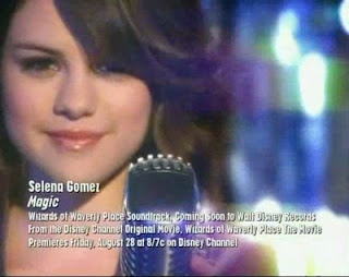 I like Selena Gomez's opening credits due to the use of different fonts. However I do think their is too much writing as credits are only on screen for 2-3 seconds. I think the use of white credits here is eye catching due to the sparkly background it brings out the white.
 My favourite credits are from Eliza Doolittle's song pack up. I think these are eye catching and the pink background really brings these out. Again she has the name of the artist, the song and the alum titles which is just enough information for the audience to read.
Friday, 1 April 2011
Changes to my digipak
So after some thought and revising my digipack research. I compared my digipack to others such as Lilly Allen, Gwen Stefania and Uffie. I realised my digipack didn't really conform to the pop genre. I have made a few minor adjustments to make my digipack look more like a pop album. To reassure myself i'm making the right descion I also asked my friend Becca what genre she thought my album cover is, she said It could be pop or indie. So therefore I definately need to make it look more pop as the audience need to be sure. The conversation is as follows:
 The 2 inside covers:
The Front cover:
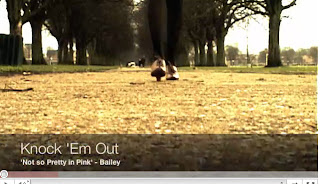
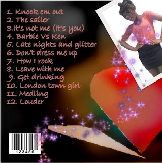
I have left the front cover as it is as I really like the cover and think it represents pop and the artist Bailey coming from a London background, likewise to Lilly Allen who's song Knock em out inspired us.
The Back cover:
I am now really happy with my design and belive it really fits my pop genre :)
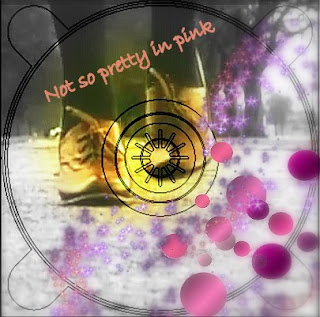
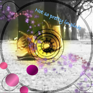
 The 2 inside covers:
Before I used a sepia effect with the colours in the background. However whilst looking at my digipack before I really didn't think it fit the pop genre of an album. I was looking at Katy Perry's album cover and hers is very much pink, blue with candy sweets. These are generic conventions of a pop album. Using Picasa photo editing software I decided to change the two inside covers and made them more girly. I added pink polka dots to each corner so when they are next to each other the polka dots will have symmetry. Instead of using a sepia effect I instead used a black and white effect with a soft focal point in the middle to bring out the colour of her shoes and bringing attention ti the centre of the CD. I then used another photo editing software called Blingee. This is actually a website to you upload the pictures then add bits. This is the only way I was able to achieve the pink glitter effect. This really stands out against the black and white and gives a real feminine touch.


The Front cover:
I have left the front cover as it is as I really like the cover and think it represents pop and the artist Bailey coming from a London background, likewise to Lilly Allen who's song Knock em out inspired us.

The Back cover:
In the back cover I've left the background and the writing the same. However I felt it was important to have a picture of the artist so the audience can recognise the album with the artist and the genre. However although most albums have the artist on the front I decided to challenge this convention. In albums such as Uffie they have also not got the artist on the front and it still looks like a pop album. due to allot of pink. Here I've used a quirky picture of Bailey and added pink sparkles from blingee.com.

I am now really happy with my design and belive it really fits my pop genre :)
Subscribe to:
Posts (Atom)