Bailey - Knock em out
Wednesday, 30 March 2011
Friday, 25 March 2011
Not so pretty in pink - Track list

Wednesday, 23 March 2011
Music advertisement conventions
An image of the artist, the digipack and video.
Band Name in bold letters
Album Name
Album reviews ... eg Daily mirror *****
Where can you purchase?...HMV, Amazon etc
Record Label Logo
Bonus tracks
main track
Website
Slogan/Strap line
Tour dates
Quotes from newspapers
Limited Edition
Offers to download
Name at the top of the advert
I will use these conventions as a guide to create my own music advertisement of my video Lilly Allen knock em out by Bailey!
Sunday, 20 March 2011
Analysis of my Digipak

This is the Final front cover of my digipak. In this cover I have challenged the conventions of a typical front cover with the artists face on it, yet still reflecting pop genre with the use of rose pink colour, and blue, purple and pink representation of girly pop. I Have also added a small label on the bottom left hand side on the album which states 'Featuring Baileys number one single 'Knock em out' with symbolic representation of pop genre using a border of ice creams. I think this gave a more quirky feel to the cover which represents Bailey as a quirky pop artist. With the use of London in the background with the artist essentially holding Big Ben this gives of a sense of power which is portrayed in the intertextual elements of the feminist theory. I didn't want to conform to the stereotypical version of a pop album with the artists face because I wanted my artist to be more original giving a sense of freedom and power which is represented with the picture. I think the audience of young teens could really relate to this as it draws them in. The font I used for Baileys name is a very girly font in a rose pink colour with hearts around. This conforms to the pop genre of hearts pink and girly which I thought would show the audience the genre strait away. My favourite bit of the cover has to be the soft focused fairy lights blended with the picture, this gives a soft, venerable feel to the cover, yet the components of the hand and London being very strong.
Back cover:

What I love about the back cover is the massive heart on the right hand side focused in red and blue. I thought using a strong red colour would show passion in the artist and prevail the pop genre and appeal to young teens as these are essentially the audience who would buy the album. The use of the shadow represents the boy in Knock em out shadowing the girl however she has a strong heart and doesn't conform to him. This again reflects the power concept throughout the video Knock em out. I've used a very girly pink font, this is to conform to pop genre characteristics and contrasts with the powerful love hear on the right hand side. The background is in a sepia effect with soft focus, I have used this to draw attention to the heard and the writing.
The 2 inside covers:


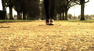
I used the screen shot of the feet walking down the path in this shot. I thought this looks like a very strong image and again portrays the power theme the artist is giving of. I contrasted and blended this in with the girly colours of purple, blue and pink on top. Furthermore the girly iconography of the lips and butterfly and symbolic codes of pop genre. I have used a rose in the second cover as a rose typically has thorns but is also romantic and girly. This represents the power feeling again as to say don't mess with me, like the knock em out video. However the rose also shows the girly side to the artist. I also added a sparkle effect on top of the CD which gives of a girly and feminine feel in binary opposition to the strong image of the shoe.
Thursday, 17 March 2011
Tuesday, 15 March 2011
split screen research
Imovie turorial:
I think were going to go with Imovie to do our split screens as it is alot simpler and we are familiar we the software. we have already started to make the split screens which I will upload on my blog on the next post.
Final cut tutorial:
I found this video very tricky to understand. Whilst trying to do the split screens we didn't even know how to add the events over from imovie. This is quite a tricky software to use as i'm so used to Imovie, however it is good for precise editing.
Here is a video of: De Staat - The Fantastic Journey Of The Underground Man
This is a fantastic video for split screens. This is a very advanced video and very inspirational. I was fascinated when I first watched it!
Below is a comment from one of the producers:
Fun and tricky is-it-or-isn't-it video by Andre Maat for Holland's De Staat. Maat says: "It seems to be a classic split-screen performance music video but then turns out to be visual trickery. We shot all effects in-camera, playing with the set-design, perspectives and colours. All 'splits' are made from wood, zippers, gaffa tape, etc." Good stuff.
Friday, 11 March 2011
Pop Music advertisements
Madonna Advertisement
Madonna is a pop genre sensation. I picked this advert as I believe it represents pop very well with the use of bright vibrant colours, bold statement letters and the artists image. The shot is a close up of Madonna, she is also pulling a very calm but seductive facial expression. This here shows that Madonna is a big star as the whole of her face nearly glazes the advert.
The main use of colours are blue, pink and yellow. These colours are very much linked to pop, this also gives the audience a taste of the music as being vibrant, dance and fun music. I think by only using a limited number of colours on the advert is more effective as the audience doesn't get confused and can focus on the main elements of the advert: The artist and album name. This is a technique I will adopt when producing my music advertisement. Furthermore I am not surprised that this advert doesn't have any magazine reviews on, this is because Madonna is such a well known and love artist everyone has high expectations of her anyway.
Britney Spears advertisement
 Unlike Madonnas album advertisement this is very different. Unlike Madonna, Britney is not gracing the cover of the advert. This is most likely because this advert was for Britney's come back album as she had not made one in a few years. The whole album was also focused around the theme of a circus; therefore this was enough for her audience to recognize the advert.
Gwen Stefanni music advertisement
Monday, 7 March 2011
Pink pillow effects

Today we edited the clip below.
We wanted a reverse effect so she throw the pillow but it looks as if it is thrown back at her so we simply added the same clip again but put a reverse on the second part:

We also wanted the pillow to be pink. Firstly we added a black and white effect to it so the pink would stand out. However this was too difficult to add the pink effect as Imovie was not that
advanced.
Tuesday, 1 March 2011
Editing progress - adding effects.

Here I added a black and white effect. I though that by breaking up the colour a bit it would make the video more dynamic

Here we added a old grain theme. This was inspired by the americano film idea. This gives our video that extra edge and makes it more interesting.

By using this heatwave effect it brang out the colours of green and blue more which made the film look brighter and more eye catching.

