
Friday, 29 April 2011

Tuesday, 26 April 2011
Editing music advertisement
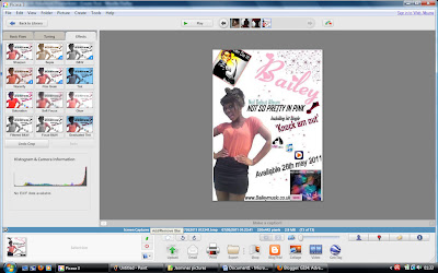
I just found out today that I couldn't use any original images from google if they were not edited and I realised that my final magazine advertisement had an un-edited image from google of the WW1 propaganda - you can do it poster. Therefore I changed it and edited the image on Picasa as photo editing software. I used a focal lack and white as this would be eye catching to the audience as it brings out the colour in the woman's facial expression on the poster. Now I have edited the image of the poster my final draft of my advertisement is now finished.

Monday, 25 April 2011
Planning my evaluation
So for our evaluation we have to answer four questions:
1) In what ways does your media product use, develop or challenge forms and conventions of real media products
2) How effective is the combination of your main product and ancillary tasks?
3) What have you learned from your audience feedback?
4) How did you use media technologies in the construction and research, planning and evaluation stages?
Here are my chosen dynamic presentations:
- PowerPoint presentation > Question 2
- Short film, uploaded to YouTube > Question 4
- Essay style, blogging > Question 3
- Images and annotations on blog > Question 1
1) In what ways does your media product use, develop or challenge forms and conventions of real media products
2) How effective is the combination of your main product and ancillary tasks?
3) What have you learned from your audience feedback?
4) How did you use media technologies in the construction and research, planning and evaluation stages?
Here are my chosen dynamic presentations:
- PowerPoint presentation > Question 2
- Short film, uploaded to YouTube > Question 4
- Essay style, blogging > Question 3
- Images and annotations on blog > Question 1
Friday, 22 April 2011
Final showing - Audience feedback
Thursday 7th April - On Thursday our media group hosted a final showing in our school hall to years 11, 12 and 13! We weren't expecting as many people that showed up so we ran out of chairs! This shows how media can unify people as they are interested in the new technologies and how we made our video. It's also inspirational to year 11's who are thinking of joining media, so I hope our video did it justice! We set up video booths at the end of people to give their commentary. Furthermore we also gave out questionnaires for people to fill in whilst viewing our video. It included questions such as 'What was your favourite part of the video.' We thought it was unnecessary to add a negative question as we couldn't improve it anyway. Whilst people watched our video I heard allot of people comment on how inspirational, funny and good it was, this was very reassuring as this shows we met the expectations of our target audience! Below are some pictures of the feedback from the questionnaires, along with a list of comments also put into a wordle. You will also find a video from two fellow peers giving us some commentary on our video from the video booth!
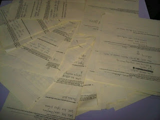
Here are just a few of the responses we got back.. pretty impressive!
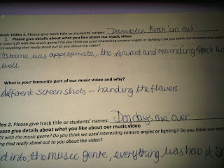
'Costume was appropriate, liked the forward and rewinding effect'
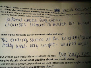
Overall I believe I was able to meet the audiences expectations, I am happy with my video and believe that in future projects I will be able to do the same again.

Here are just a few of the responses we got back.. pretty impressive!

'Costume was appropriate, liked the forward and rewinding effect'

'Different angles, song choice, locations matched the mood;
" Fits with music genre - Excellent"
"Loved all the different shots"
"Video went well with the song choice"
"Favourite part, the ending scene"
"Good effects and camera angles"
"Great lighting"
"Good use of different camera angles"
"Good locations, which matched song choice"
"White background was very effective"
"Fast pace shots worked well"
"Good use of rewinding effect"
"Good lip syncing"
"Fun video, matches song"
"Fantastic costumes, and locations"
"Great range of shots"
"very funny/cute"
"Excellent split screens"
"Funny/well edited"
"Creative use of props/costumes'
Use of props connect with the lyrics"
"Fantastic camera angles"
Great variety, fits with genre"
"Quirky and enjoyable because of the location changes"
"Upbeat got me grooving in my seat"
"Creative and effective ending"
" Fits with music genre - Excellent"
"Loved all the different shots"
"Video went well with the song choice"
"Favourite part, the ending scene"
"Good effects and camera angles"
"Great lighting"
"Good use of different camera angles"
"Good locations, which matched song choice"
"White background was very effective"
"Fast pace shots worked well"
"Good use of rewinding effect"
"Good lip syncing"
"Fun video, matches song"
"Fantastic costumes, and locations"
"Great range of shots"
"very funny/cute"
"Excellent split screens"
"Funny/well edited"
"Creative use of props/costumes'
Use of props connect with the lyrics"
"Fantastic camera angles"
Great variety, fits with genre"
"Quirky and enjoyable because of the location changes"
"Upbeat got me grooving in my seat"
"Creative and effective ending"
Below is a wordle of words which often came up in the questionnaire.

Here is a video from the video booth of two of our peers giving us some feedback. This made us really happy as they really enjoyed it and they are the target audience we want to reach, so I feel reassured we have met their expectations... enjoy
Below I have summarised my feedback into 2 tables: a pie chart and a bar chart. This makes it easier for my to evaluate the strong parts of my video, and see what the audience enjoyed most. I will then be able to see if I conformed to the pop genre and met the audiences expectations. In the pie chart I showed my video to my form and asked them to say what aspects of the film they thought were the best. Here are my results.
my bar chart:
< Here this shows that people thought the editing was the best. This is very reassuring as the editing is the main component which fits the video together.
my pie chart: Overall this shows that people had very similar views of my video and they thought all aspect were good. These were the most familiar comments which popped up
Overall I believe I was able to meet the audiences expectations, I am happy with my video and believe that in future projects I will be able to do the same again.
Tuesday, 19 April 2011
Glitter effect

Today our group went up to the media room to edit the glitter scene. At first we edited to you saw the glitter been thrown at the protagonist once. However after Miss Foster watched it she thought it was abit plain. As the shot was so glamorous and sparkly we needed some kind of effect. Therefore we added a jumpy effect to make it more quirky.
Friday, 15 April 2011
Our split screens.
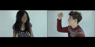
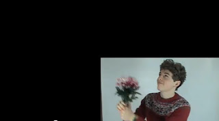
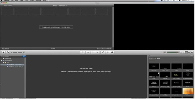
So after deciding to compose our split screens on Imovie below is our final product! We had to click on preferences to get the extra tools up which allowed us to conduct this editing. They make our video look allot more dynamic and profession, I am very happy with them.


Sunday, 10 April 2011
my opening credits.
In Imovie ttoday my group and I created our opening credits. We researched into how to make the credits on youtube as it has been a whole year since we last did this from our year 12 project on horror films. Below is the simple video we followed from youtube.
After following these steps this is now fresh in our memory. Firstly we selected the right transition we wanted. We decided to use the transition 'dark aroma' this was just a small dark rectangle and we chose to add white writing as this would look effective. We then chose the font 'round' as it was simple, but not to boring. This was eyecatching, however did not take the focus away from the main video. Below are the images of us creating the credits and our final version.
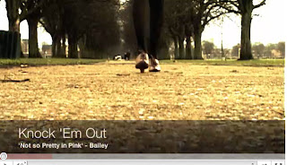
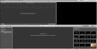
After following these steps this is now fresh in our memory. Firstly we selected the right transition we wanted. We decided to use the transition 'dark aroma' this was just a small dark rectangle and we chose to add white writing as this would look effective. We then chose the font 'round' as it was simple, but not to boring. This was eyecatching, however did not take the focus away from the main video. Below are the images of us creating the credits and our final version.

Subscribe to:
Posts (Atom)