So it's time to add my opening credits to our music video as it is nearly completed. I am thinking of having the titles at the start if the video and having them quite simple so it doesn't distract the audience away from the video. Here are a few examples of opening titles I've found after watching various music channels such as MTV, base and 4music.

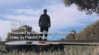
These are the opening titles for billy Kay's video this time. They have added the name, song title and who it's produced by. I like these titles as they are quite simple and suit the calm scene of the song. However I do find these a little boring, and I think the writing is too big for the screen as it takes your eye away from the main focus; the video.

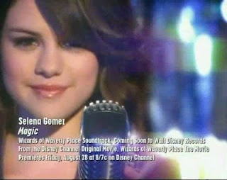
I like Selena Gomez's opening credits due to the use of different fonts. However I do think their is too much writing as credits are only on screen for 2-3 seconds. I think the use of white credits here is eye catching due to the sparkly background it brings out the white.

My favourite credits are from Eliza Doolittle's song pack up. I think these are eye catching and the pink background really brings these out. Again she has the name of the artist, the song and the alum titles which is just enough information for the audience to read.
 These are the opening titles for billy Kay's video this time. They have added the name, song title and who it's produced by. I like these titles as they are quite simple and suit the calm scene of the song. However I do find these a little boring, and I think the writing is too big for the screen as it takes your eye away from the main focus; the video.
 I like Selena Gomez's opening credits due to the use of different fonts. However I do think their is too much writing as credits are only on screen for 2-3 seconds. I think the use of white credits here is eye catching due to the sparkly background it brings out the white.
 My favourite credits are from Eliza Doolittle's song pack up. I think these are eye catching and the pink background really brings these out. Again she has the name of the artist, the song and the alum titles which is just enough information for the audience to read.
No comments:
Post a Comment
Note: only a member of this blog may post a comment.