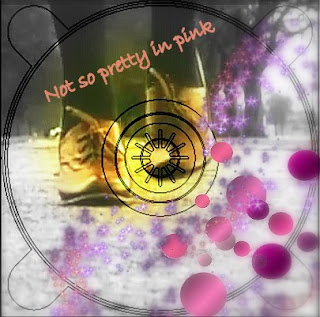
 The 2 inside covers:
Before I used a sepia effect with the colours in the background. However whilst looking at my digipack before I really didn't think it fit the pop genre of an album. I was looking at Katy Perry's album cover and hers is very much pink, blue with candy sweets. These are generic conventions of a pop album. Using Picasa photo editing software I decided to change the two inside covers and made them more girly. I added pink polka dots to each corner so when they are next to each other the polka dots will have symmetry. Instead of using a sepia effect I instead used a black and white effect with a soft focal point in the middle to bring out the colour of her shoes and bringing attention ti the centre of the CD. I then used another photo editing software called Blingee. This is actually a website to you upload the pictures then add bits. This is the only way I was able to achieve the pink glitter effect. This really stands out against the black and white and gives a real feminine touch.

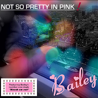
The Front cover:
I have left the front cover as it is as I really like the cover and think it represents pop and the artist Bailey coming from a London background, likewise to Lilly Allen who's song Knock em out inspired us.
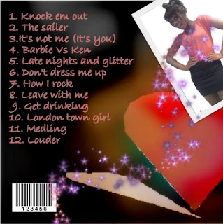
The Back cover:
In the back cover I've left the background and the writing the same. However I felt it was important to have a picture of the artist so the audience can recognise the album with the artist and the genre. However although most albums have the artist on the front I decided to challenge this convention. In albums such as Uffie they have also not got the artist on the front and it still looks like a pop album. due to allot of pink. Here I've used a quirky picture of Bailey and added pink sparkles from blingee.com.
I am now really happy with my design and belive it really fits my pop genre :)
No comments:
Post a Comment
Note: only a member of this blog may post a comment.